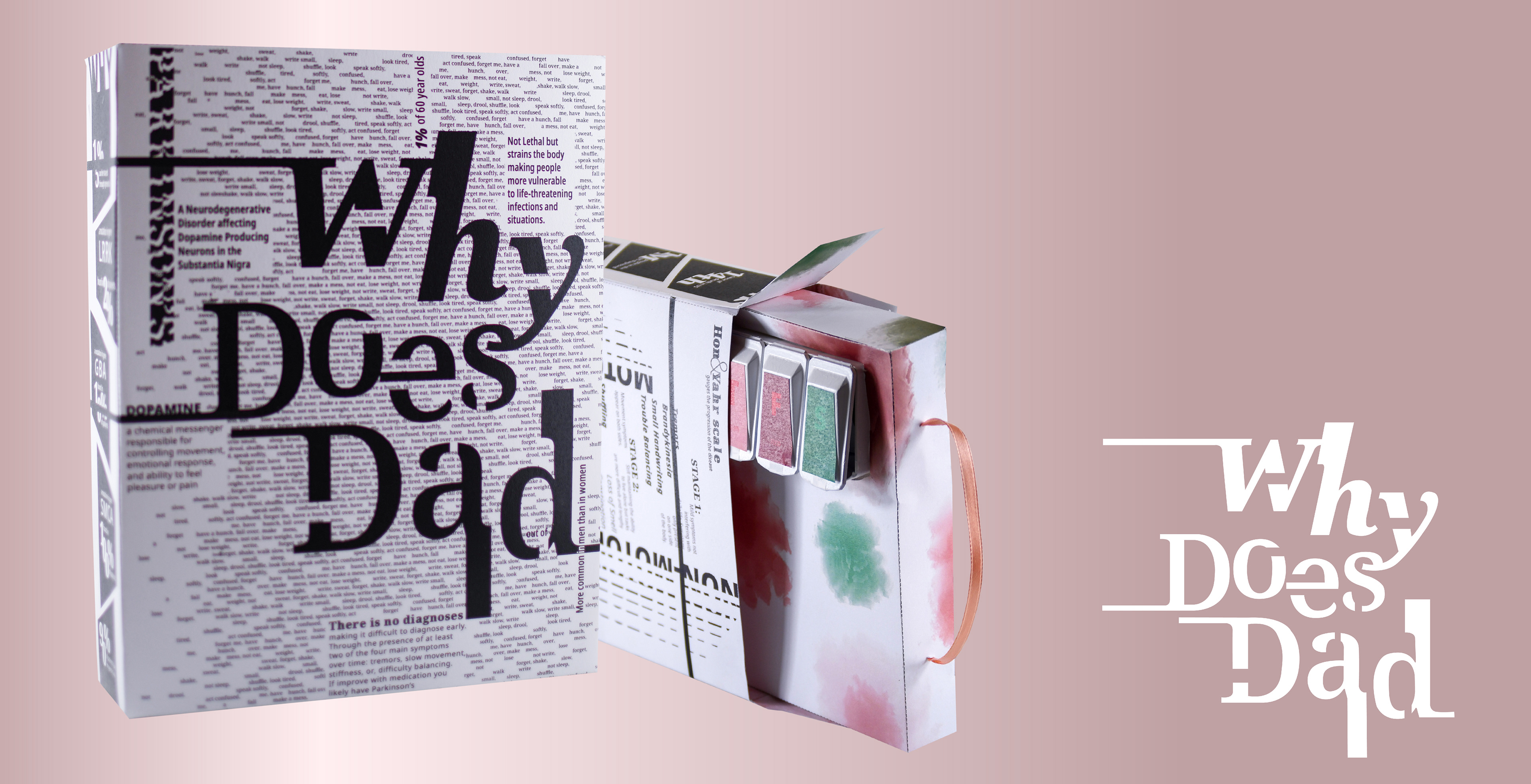
CONCEPT
Why Does Dad is an experimental typography project which focuses on the effects, causes, and treatment of Parkinson's disease. The special challenges with this project were avoiding relying on graphics and instead using typography in new exciting ways as a way to represent the information. This project consists of a single font family utilized as texture, shapes, and patterns.
BOX EXTERIOR
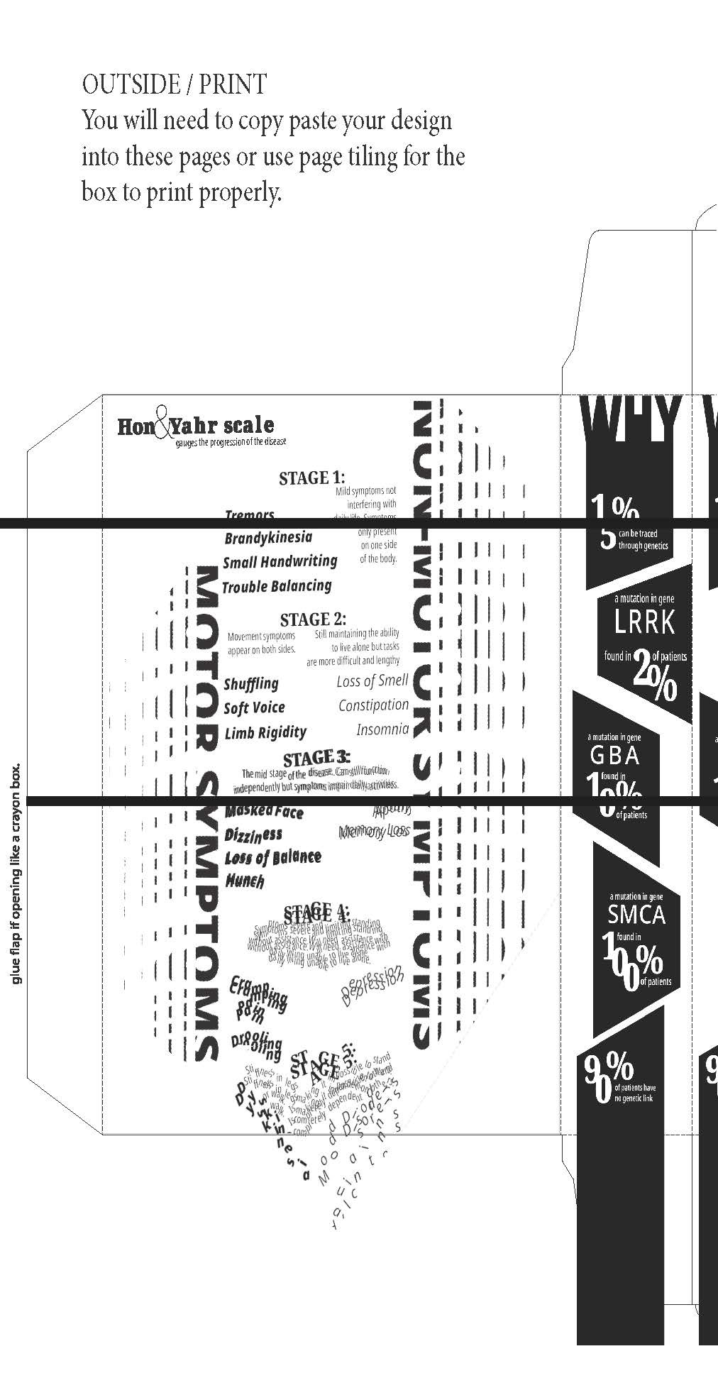
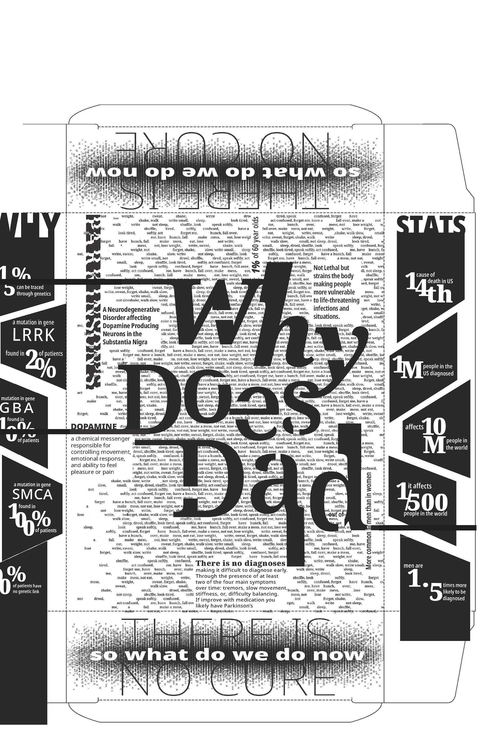
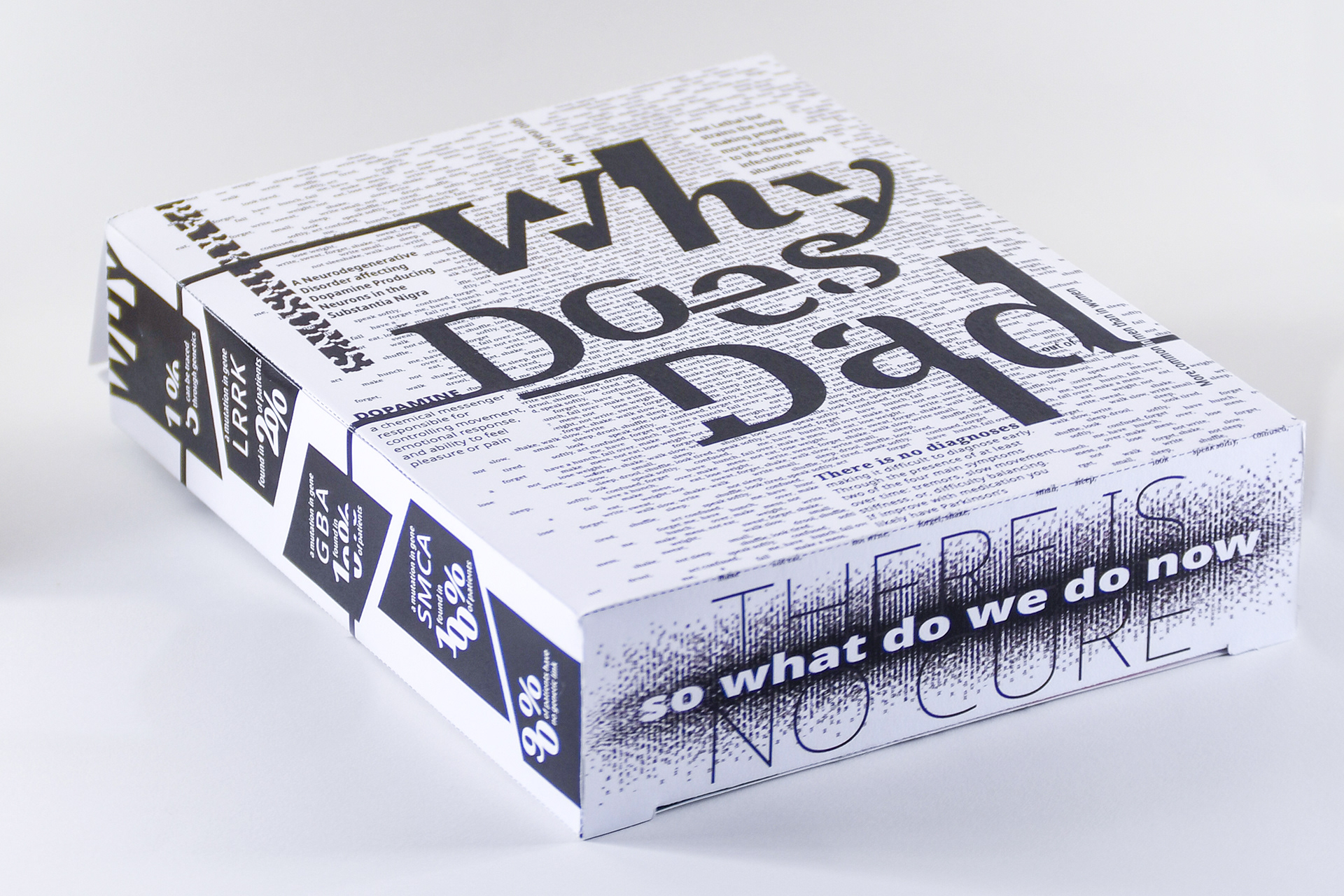
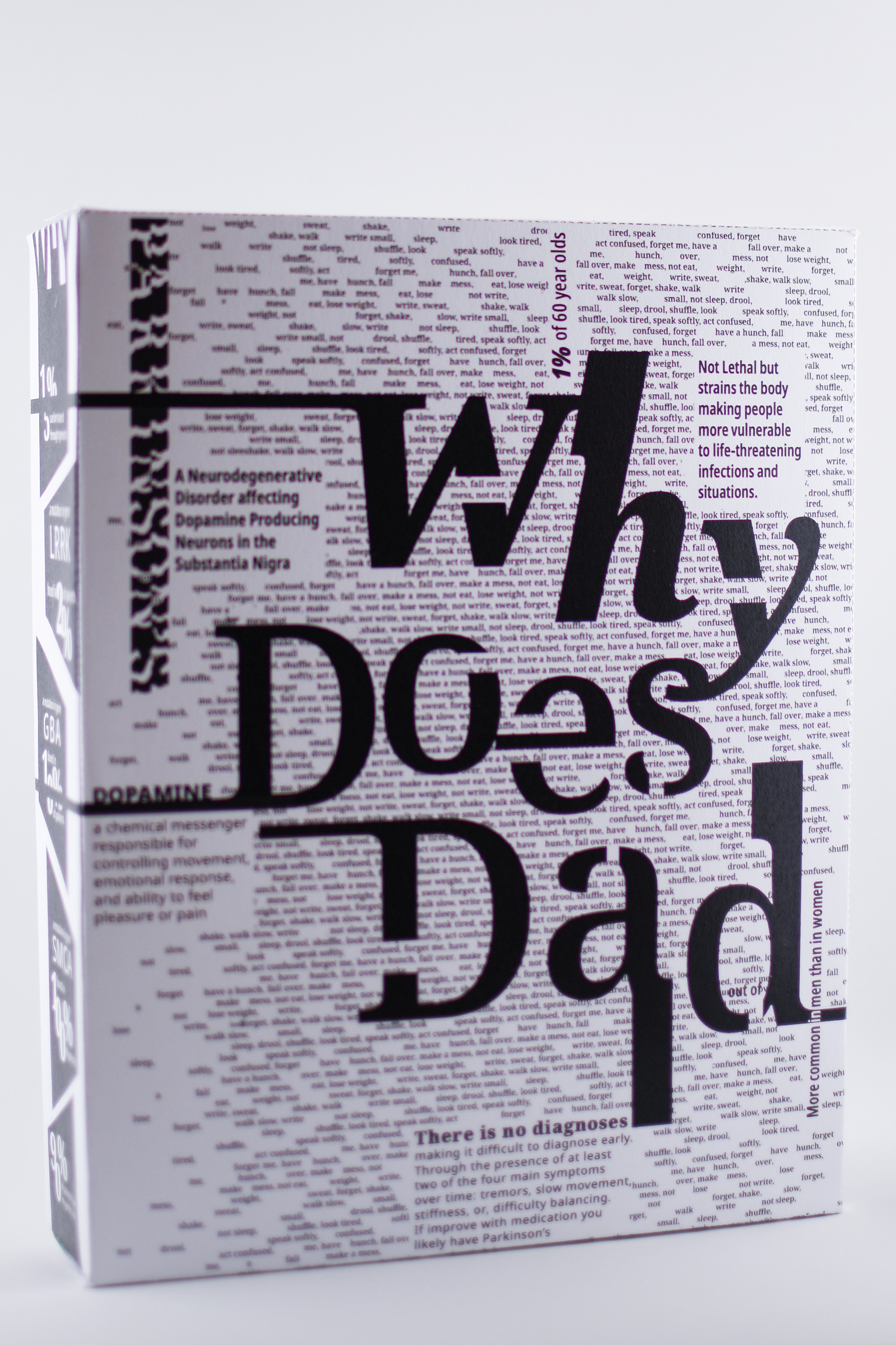
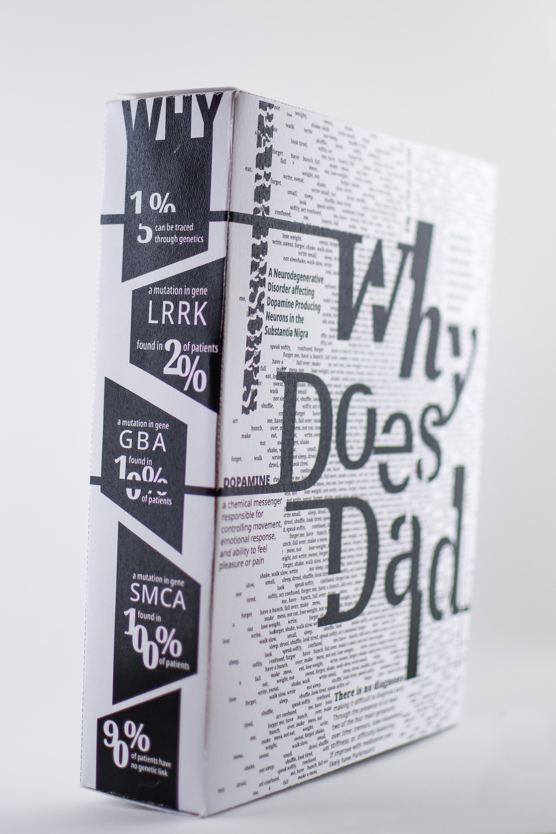
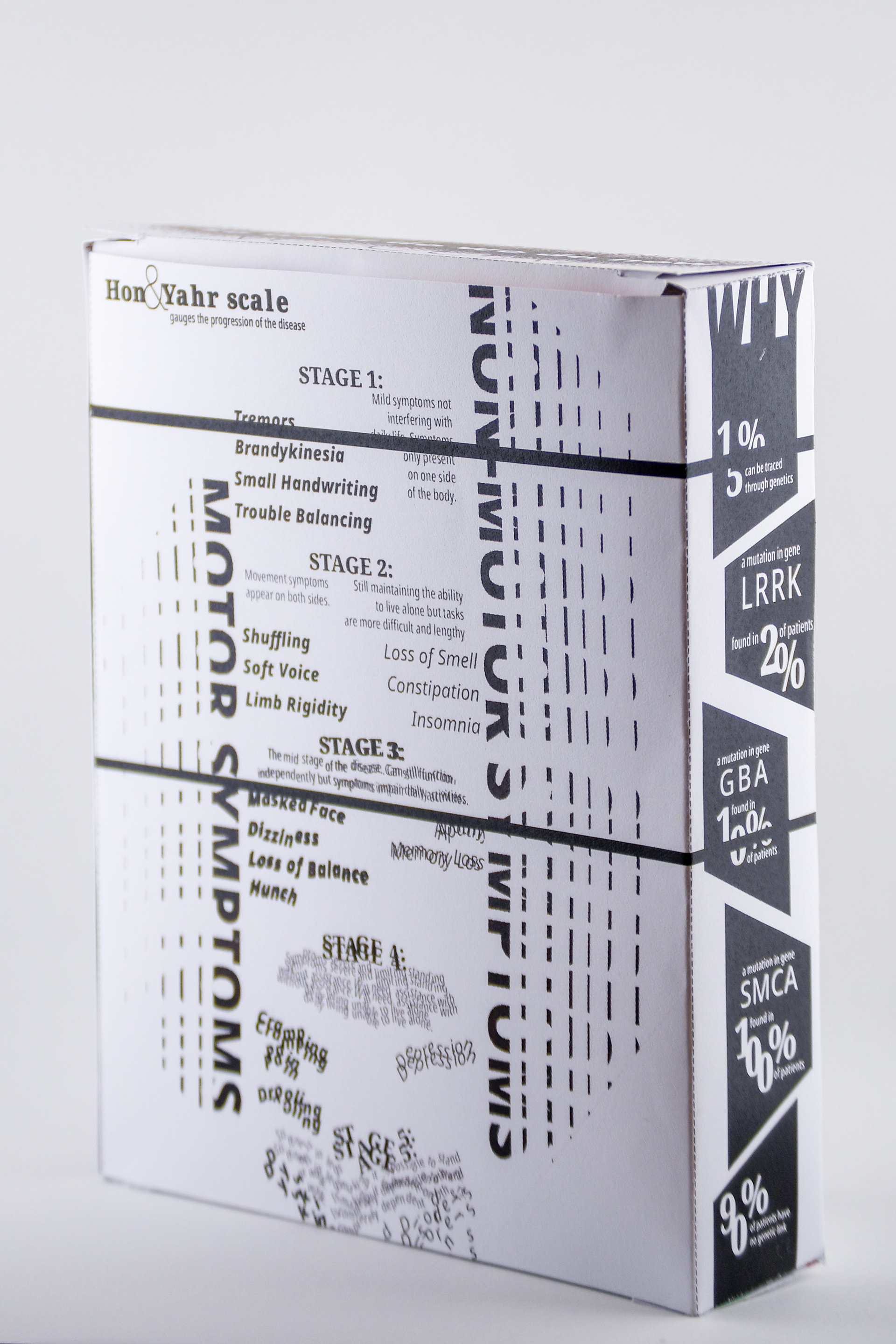
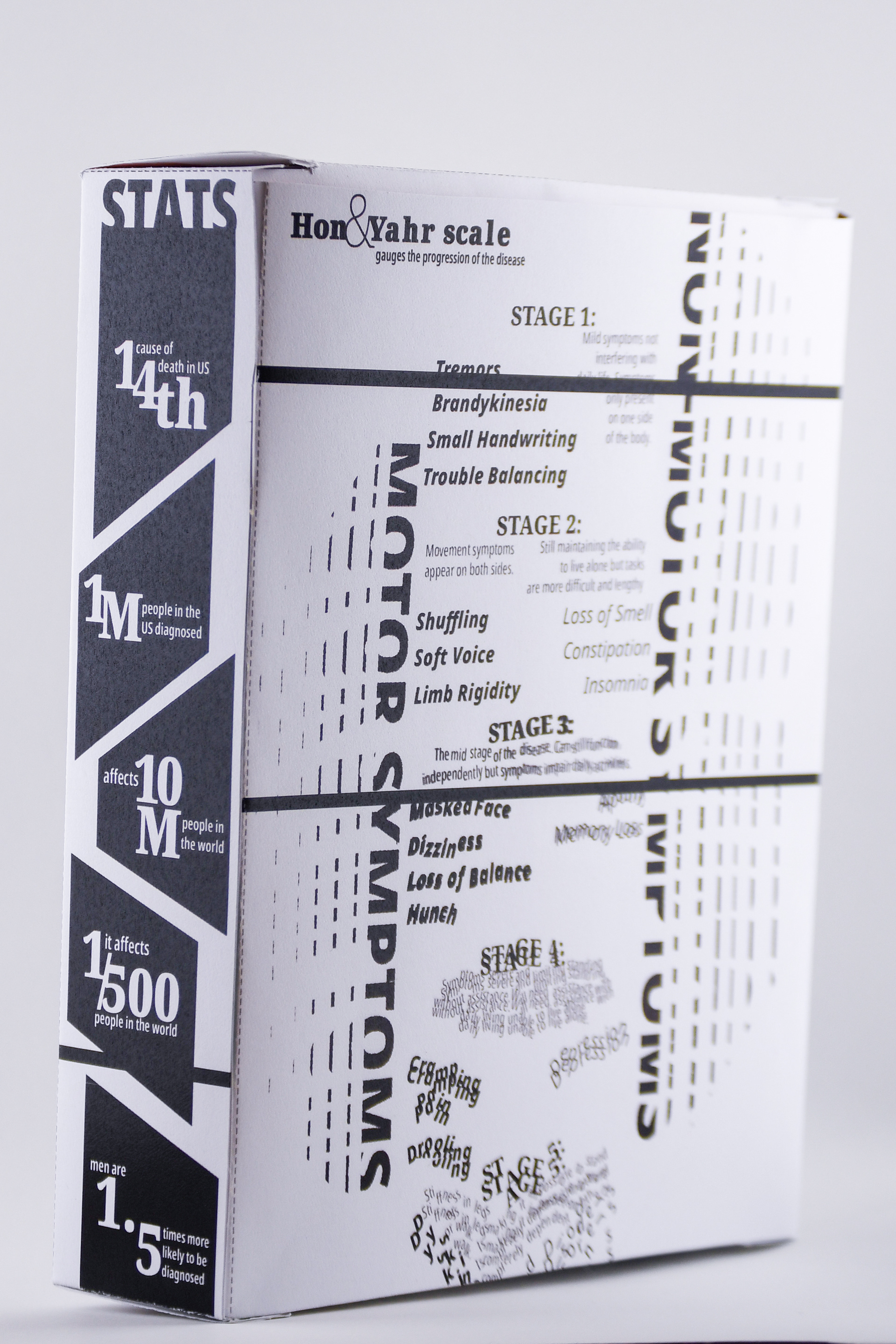
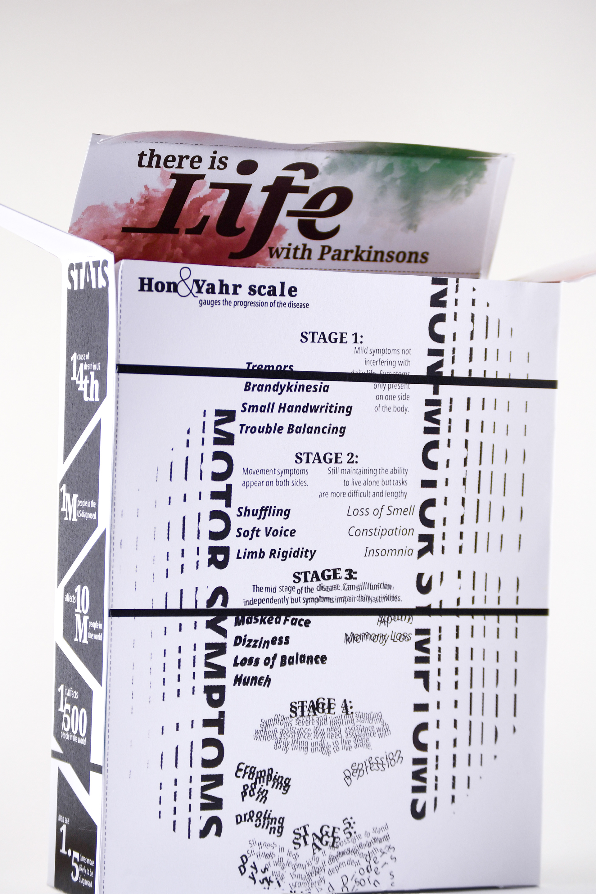
The front of the box provides a basic overview of Parkinson’s disease. The sides of the box break down statistics divided into two categories, the what and the why. The back of the box depicts how the disease is monitored on the Hon and Yahr scale. To represent the deterioration of motor skills the text distorts more and more as the scale progresses. While the outside is black and white and focuses only on text the inside has a bright floral pattern.
OPENING THE BOX
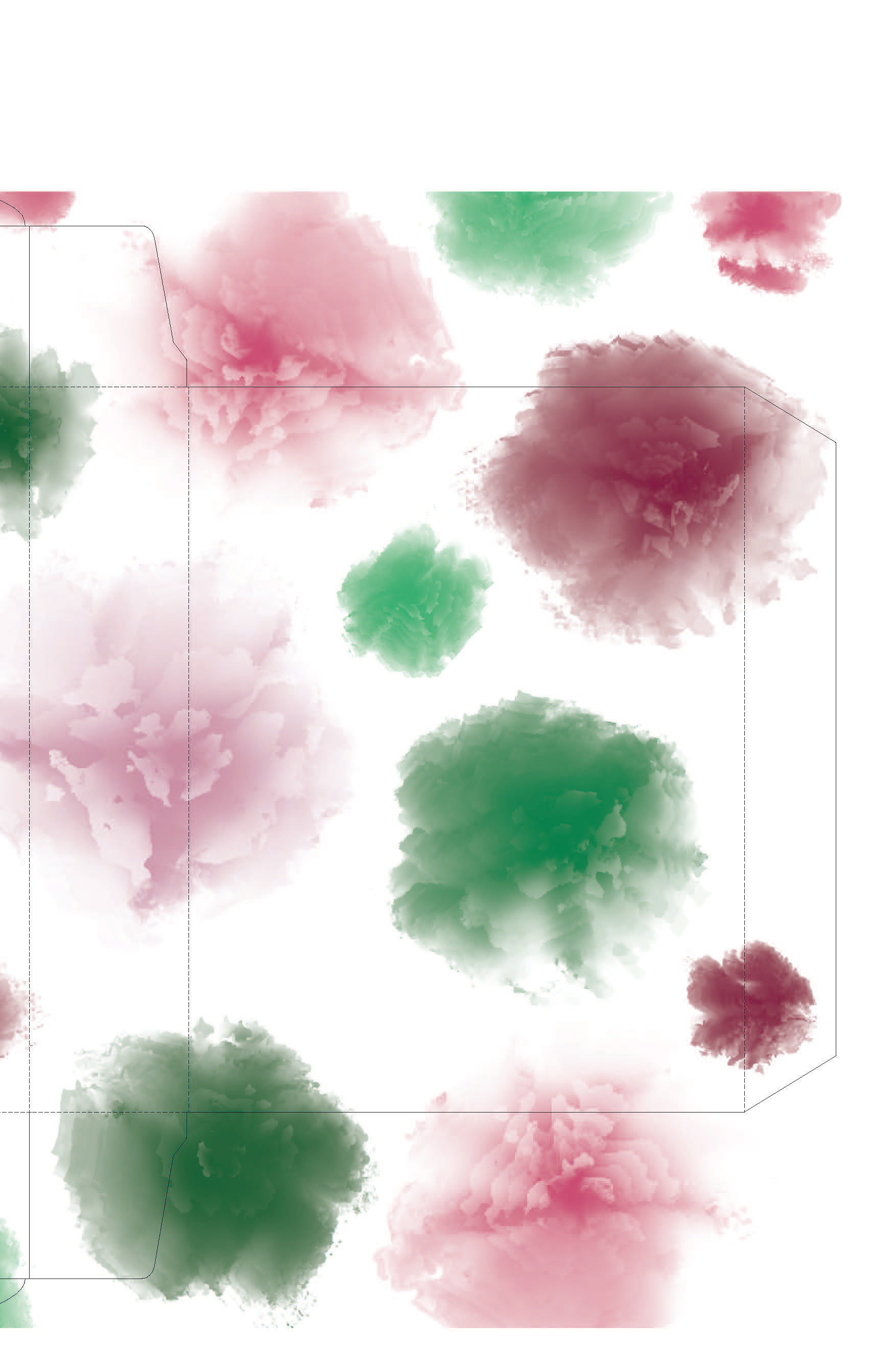
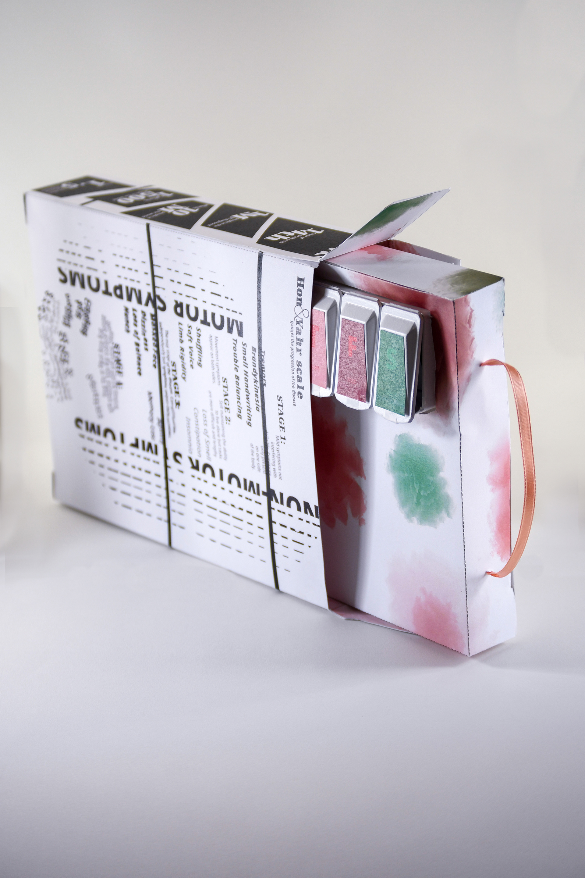
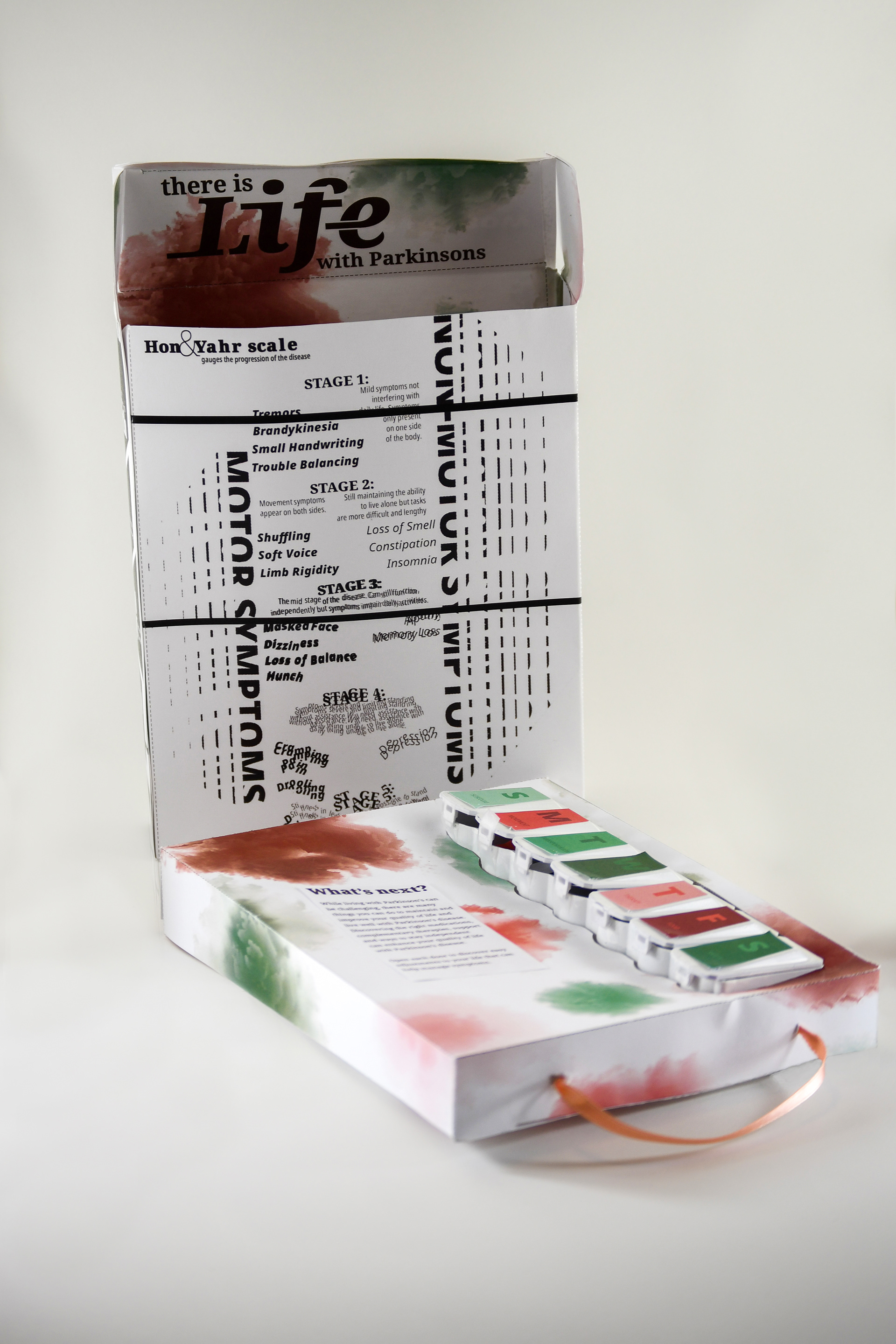
When opening the box you will notice the stark contrast of color inside. The pink and green design of the pull-out is inspired by Parkinson’s awareness colors and utilized to represent the new life that a patient can have with Parkinson's. The foundation is represented by a tulip representing the new growth a patient takes when battling this disease. I took this concept and abstracted the flower form to create a bursting floral pattern to decorate the inside elements of the box.
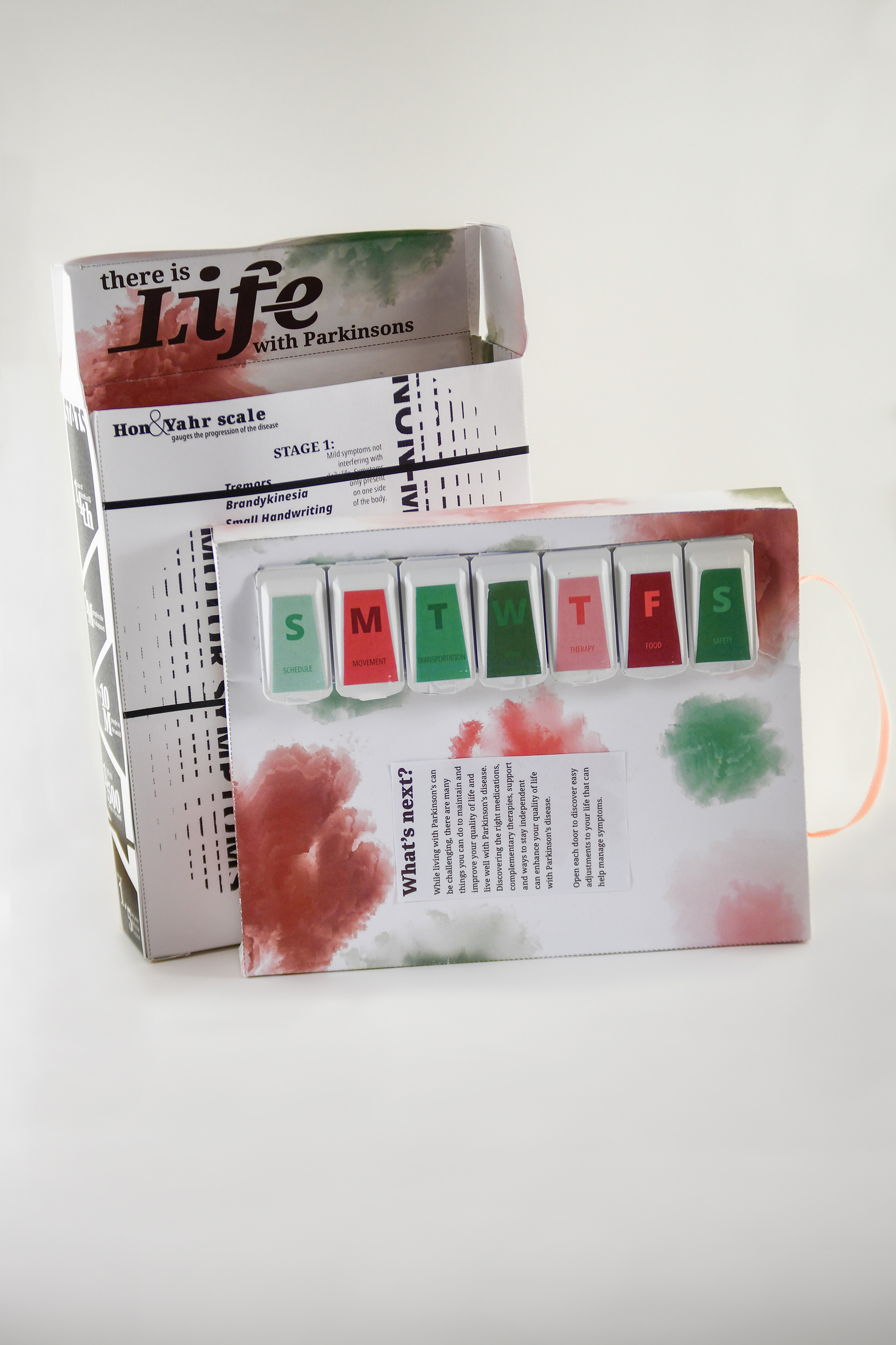
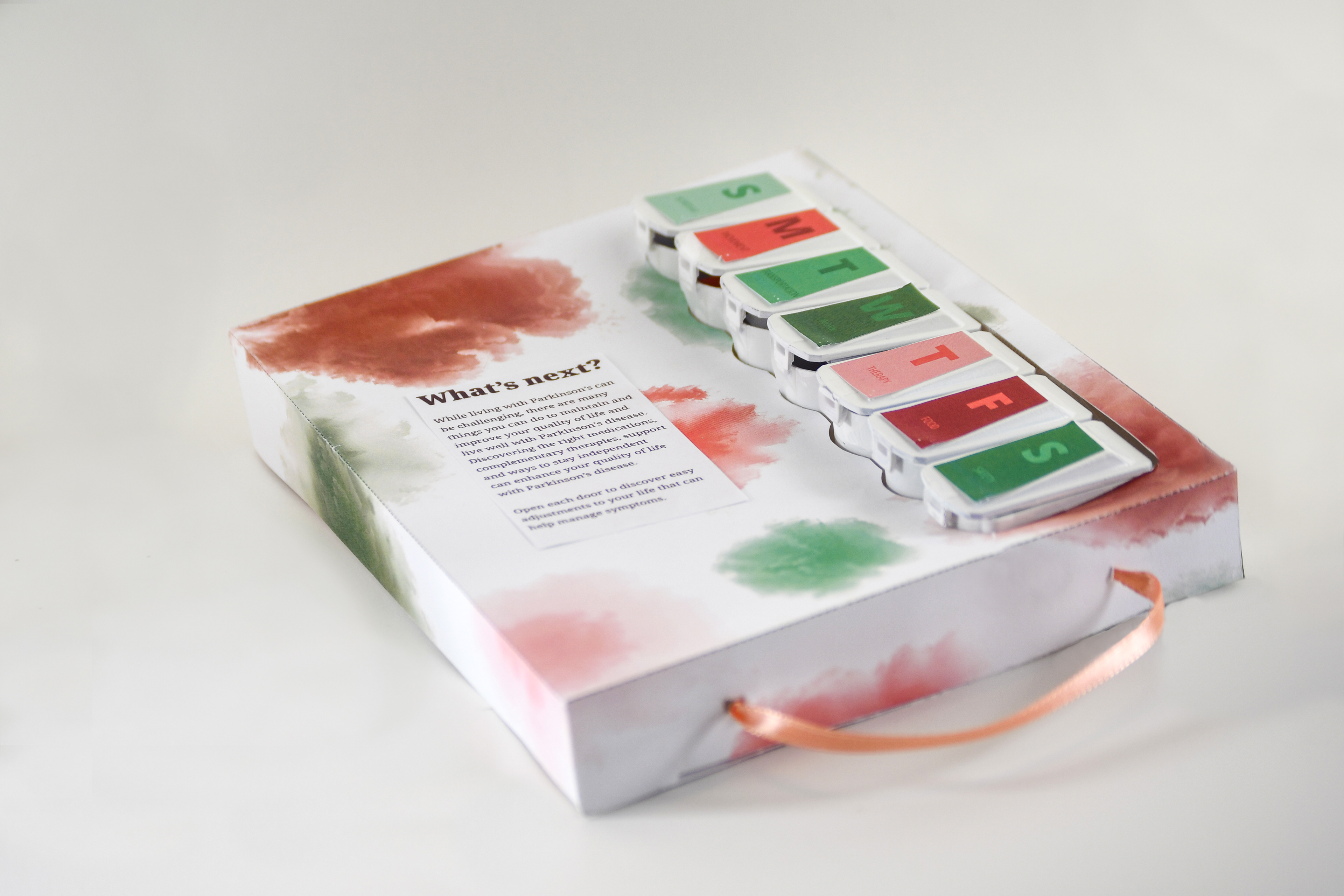
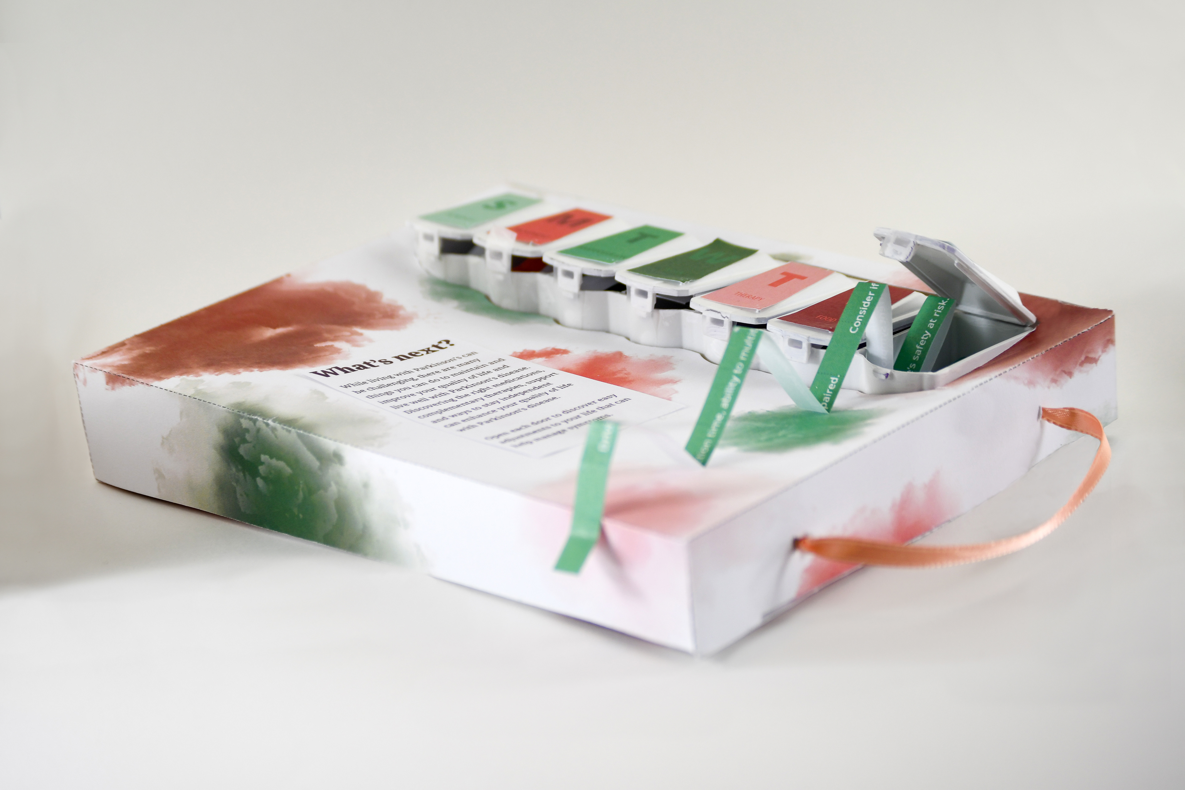
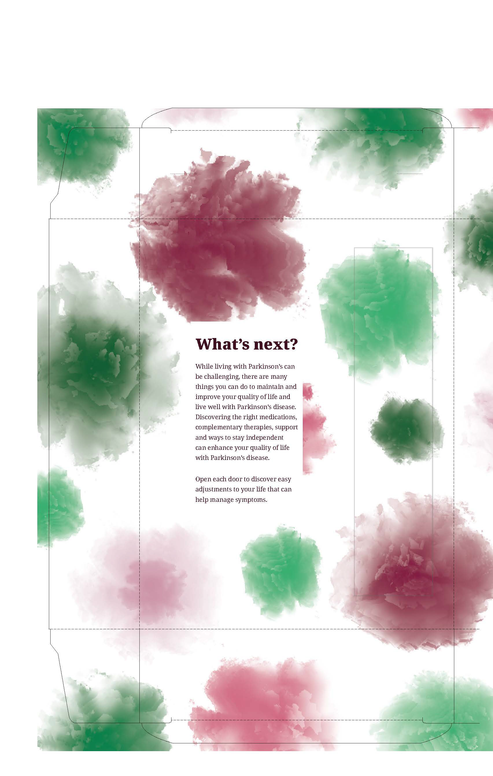
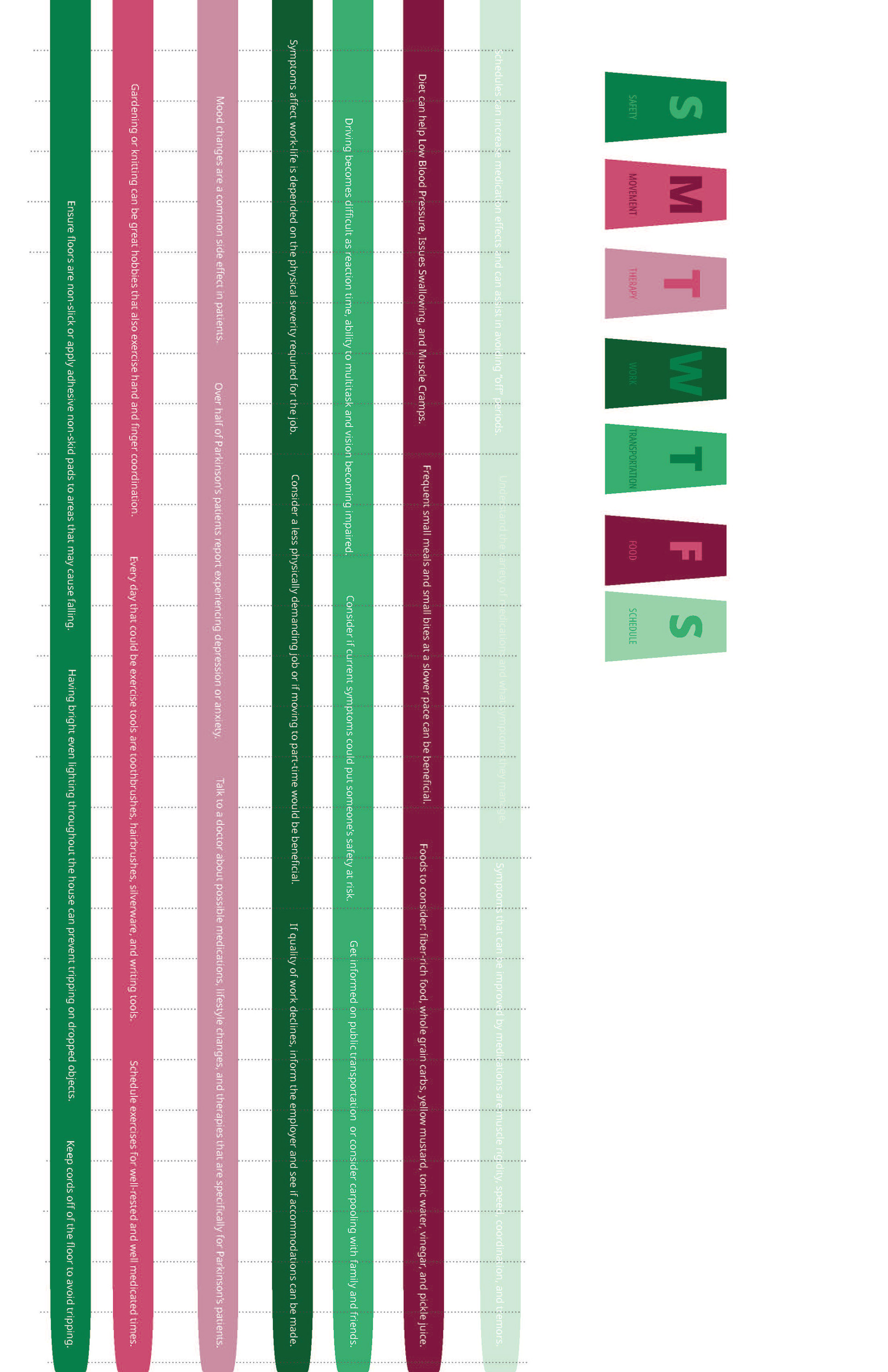
INTERACTIVE INFORMATIONAL GUIDE
The inside guides a viewer into how to live with Parkinson’s and what the next steps are. The information is broken down in weekly pill divider as this is a system someone with the disease has to live by. Each day has a set of small changes that could greatly improve the quality of life for someone with this disease.